

A grants analytics dashboard is a centralized visual reporting tool that pulls award, pipeline, and performance data into one live view, letting grant managers see application status, funding distribution, and deadlines without pulling separate reports. Grant managers, program leads, and researchers rely on it for one reason: reliable, at-a-glance visibility into what's in the pipeline, what's been awarded, and how programs are performing against goals.
TL;DR:
- Monitoring application volume, abandonment rate, and eligibility pass rate during pre-award helps identify applicant pool trends and program efficiency.
- Tracking review completion percentage and score distribution allows early detection of bottlenecks, ensuring deadlines are met before delays occur.
- Operational metrics like average time in each stage and win rate over multiple cycles reveal process inefficiencies and shifting funder priorities.
- Designing role-based views and matching visual types to questions improve dashboard clarity and accessibility for diverse users.
- Regular data validation, access logs, and clear audit trails are essential for maintaining trustworthiness and compliance over time.
Table of Contents
- What Does a Grants Analytics Dashboard Show Across the Grant Lifecycle?
- Which KPIs Should You Track at Each Grant Lifecycle Stage?
- How Should You Design a Grants Dashboard for Clarity?
- How Do You Set Up a Grants Analytics Dashboard?
- How Do You Keep a Grants Dashboard Trustworthy Over Time?
- What Are the Common Blocks on a Grants Dashboard?
- What Security and Privacy Rules Apply to Grants Analytics Dashboards?
- Who Uses a Grants Dashboard and What Permissions Do They Need?
- How Do You Turn Dashboard Data Into Action?
- What Do Successful Grants Dashboard Implementations Look Like?
- What Compliance and Audit Features Should a Grants Dashboard Include?
- Author Perspective: Common Pitfalls and a Recommended Approach
- How Rutledge & Associates Can Help With Grants Analytics Dashboards
- Sources
What Does a Grants Analytics Dashboard Show Across the Grant Lifecycle?
A grant management dashboard earns its place in daily workflows by tracking every phase of the lifecycle instead of just the finish line. During planning and intake, it visualizes application volume and eligibility screening results. Once review begins, it shows reviewer progress and scoring patterns so program officers can spot bottlenecks before deadlines slip.
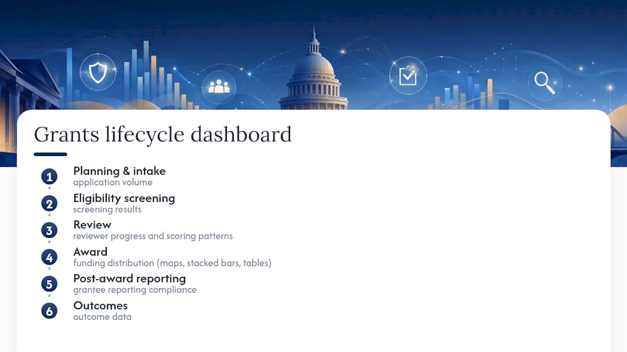
At the award stage, funding distribution appears through maps, stacked bar charts, and recipient tables, often broken down by service area or geography to check whether money is reaching the communities it's meant for. Post-award, the same dashboard tracks grantee reporting compliance and outcome data.
The practical shift is workflow, not just visuals. Instead of a program officer building a status report by hand every Friday, the numbers update automatically and decisions happen faster. Interactive views used by organizations managing large award portfolios, like CGIAR's active grants dashboards, show how many awards a single interface can surface without burying users in spreadsheets.
Which KPIs Should You Track at Each Grant Lifecycle Stage?
Not every metric deserves screen space. The strongest grant reporting dashboards organize KPIs by lifecycle stage, because a number that matters during intake often means nothing during post-award reporting. Lifecycle analytics treats the dashboard as an operational tool that adapts to whatever stage a grant is in, rather than a static report that shows the same fixed set of numbers regardless of context.
Here's how to prioritize:
- Pre-award: application volume, abandonment rate, eligibility pass rate.
- Review: reviewer completion percentage, score distribution, average review time.
- Award and post-award: total awarded amount, funding distribution by category or geography, reports due, grantee outcome indicators.
- Operational health: win rate, average time spent in each stage, count of at-risk or stalled grants.
The operational metrics matter more than most teams realize. A dashboard that only shows dollars awarded tells you what happened; one that shows average time in stage tells you where your process is breaking down. Win rate by program or funder is another underused metric. Tracking it over multiple cycles reveals whether a decline is about proposal quality or about a funder's shifting priorities, which are two very different problems to solve.
How Should You Design a Grants Dashboard for Clarity?
Layout decides whether a dashboard gets used or ignored after the second week. The most cited guidance on this comes down to a few consistent rules: put the highest-priority panels in the top left, group charts that answer related questions together, and never let a chart stand alone without context about its filters or date range.
Role-based views matter just as much as layout. An executive sponsor wants a portfolio-level summary; a program officer needs stage-by-stage detail with reviewer names attached. Building both into one cluttered screen defeats the purpose of a dashboard in the first place. Saved filters and saved report views solve this without requiring separate tools. Modern grant platforms increasingly support this natively, letting a program lead save their filtered view of "grants in review, my portfolio only" while an executive keeps a separate saved view showing totals across every program.
Match the visual type to the question being asked. Geographic questions need a map. Comparisons across categories need stacked bars. Reviewer accountability needs a leaderboard, not a pie chart. Accessibility deserves attention too, since color-only encoding excludes colorblind users and screen-reader-incompatible charts exclude others entirely, making nonprofit accessibility grants a crucial consideration for inclusive program design. nonprofit accessibility grants
Pro Tip: Add a small text footnote under every chart stating the data source and last refresh time. It takes ten seconds to build and eliminates most of the "wait, is this number current?" questions that erode trust in a dashboard.
How Do You Set Up a Grants Analytics Dashboard?
Building a dashboard that people actually trust follows a fairly consistent sequence, regardless of which platform you use.
- Define 3 to 5 KPIs tied to your program's mission, along with the primary users who will rely on each one.
- Inventory your data sources and map fields across systems before writing a single query.
- Prototype with historical or sample data first. Validating design choices against real operational questions before a full rollout catches problems while they're still cheap to fix.
- Review the prototype with actual stakeholders, not just IT, and set up role-based views based on their feedback.
- Configure alerts and export options, and document the data lineage so every KPI can be traced back to its source.
- Train users on interpretation, not just navigation, and put a QA and maintenance schedule on the calendar before launch day.
Resist the urge to launch everything at once. Small, defined pilots that cover one or two KPIs and a single user role tend to see faster adoption than a big-bang rollout that tries to satisfy every stakeholder in one release.
How Do You Keep a Grants Dashboard Trustworthy Over Time?
A dashboard loses credibility the moment users catch it showing a wrong number, and it rarely recovers fully after that. Building a maintenance rhythm around it prevents most of that damage before it happens.
- Daily or weekly: confirm data loads completed and check for freshness gaps.
- Monthly: review KPIs for drift (metrics nobody looks at anymore) and audit user permissions.
- Quarterly: sit down with stakeholders to confirm the dashboard still answers their real questions, and retire widgets that don't.
Watch for a few consistent red flags: award totals that don't match finance system records, sudden data gaps with no explanation, or the same error message appearing across multiple sessions. Any one of these, left unaddressed for even a few weeks, can quietly convince a program director to stop trusting the dashboard altogether and go back to manual spreadsheets. Organizations that maintain detailed compliance analytics as part of their reporting infrastructure tend to catch these issues faster, simply because someone is already checking the numbers on a schedule.
What Are the Common Blocks on a Grants Dashboard?
Most well-built grant reporting dashboards converge on a similar set of visual blocks, because they answer the same handful of recurring questions every grant team asks.
Pipeline by stage shows how many grants sit in each phase, from intake through review to award, usually as a funnel or stacked bar. It's the first thing most program officers check each morning, since it answers "where is everything right now" faster than any other view.
Due soon surfaces deadlines within a defined window, whether that's application closing dates, review due dates, or report submission deadlines. This block prevents the scramble that happens when a deadline gets missed simply because nobody was tracking it.
Reports due tracks post-award compliance obligations, showing which grantees owe progress or financial reports and which submissions are overdue. For programs with heavy compliance requirements, this block often gets more daily attention than the award totals themselves.
Awards summarizes what's been funded, typically broken out by program, geography, or funding category, and paired with total dollar figures. Effective pipeline dashboards pair these blocks with clear ownership indicators and blocker flags, so a stalled grant doesn't just sit invisible in a queue. A grant with a missing signature or an incomplete document should visually stand out, not blend into a list that looks identical to every grant moving normally through the process.
What Security and Privacy Rules Apply to Grants Analytics Dashboards?
Grant data almost always includes sensitive information: applicant financial details, personal identifiers, sometimes information about vulnerable populations served by a program. That makes access control a design requirement, not an afterthought bolted on after launch.
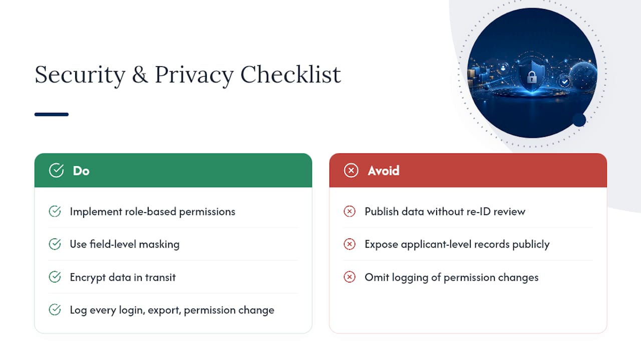
Role-based permissions are the foundation. A reviewer should see applications assigned to them, not every applicant's financial disclosures across the entire portfolio. Field-level masking helps too. A dashboard can show aggregate award totals to a broad audience while restricting the underlying applicant-level records to a smaller group with a legitimate need to see them.
Data-in-transit encryption and secure authentication (multi-factor authentication where possible) protect the dashboard itself, but the access model behind it matters just as much. Every login, export, and permission change should generate a log entry, both for security monitoring and because that log becomes evidence during an audit.
Public-facing dashboards need a different level of scrutiny than internal ones. Publishing aggregate statistics, like the California Grants Portal's downloadable post-award data, works well for transparency, but only after confirming that no combination of published fields could re-identify an individual applicant or grantee. That review step is easy to skip under deadline pressure and expensive to skip in practice. For agencies managing government IT modernization broadly, security and audit trail requirements tend to run through the same compliance framework that governs every other system, not a separate carve-out just for grants data.
Who Uses a Grants Dashboard and What Permissions Do They Need?
Most grants analytics dashboards serve four or five distinct roles, and each one needs a different slice of the same underlying data.
Grant managers typically get the broadest view: full pipeline visibility, award data, and reporting compliance across their portfolio, plus permission to configure alerts and export data for external reporting.
Program officers or reviewers usually see only the applications and grants assigned to them, along with review deadlines and scoring tools, without visibility into the full financial picture across every program.
Finance staff need award amounts, disbursement schedules, and budget data, often with limited need to see narrative application content or reviewer notes.
Executive sponsors and leadership want portfolio-level summaries: total awarded, win rate trends, and program performance, generally without the granular detail that would clutter a strategic view.
External stakeholders, including grantees themselves in some systems, may get a narrow, read-only view limited to their own award status and reporting obligations.
Getting this permission structure right early prevents two common failure modes: over-restricting access so people can't do their jobs, or under-restricting it so sensitive applicant data ends up visible to far more people than necessary. Role-specific dashboard views solve most of this by design, since each role only ever sees the metrics relevant to their work rather than a single undifferentiated view shared by everyone.
How Do You Turn Dashboard Data Into Action?
A dashboard full of accurate numbers is worthless if nobody changes behavior because of them. Reading the data well starts with looking for trends rather than single data points. One slow month in application volume means little; three consecutive months of decline against a stable funder relationship signals a real problem worth investigating.
Cross-reference metrics before drawing conclusions. A high win rate paired with declining application volume might look like success, but it could actually mean your applicant pool has narrowed and only the strongest candidates are still applying. Look at review completion rate alongside average score, too. A reviewer finishing applications unusually fast with unusually high scores is worth a closer look; it may signal review fatigue rather than genuinely stronger applications.
When a KPI moves outside its normal range, ask what changed in the underlying process before assuming the dashboard is malfunctioning. A sudden spike in average time-in-stage for review, for example, might trace back to a reviewer going on leave, not a systemic bottleneck. Building this kind of interpretation habit into monthly reviews, rather than treating the dashboard as something you glance at only when a funder asks a pointed question, is what separates programs that actually use their data from programs that just collect it.
What Do Successful Grants Dashboard Implementations Look Like?
Regional and consortium-level dashboards offer some of the clearest examples of what a well-built grants analytics dashboard delivers in practice. A regional COVID response dashboard mapped grant awards by service area, letting program leaders see funding distribution across counties and census tracts in near real time. That kind of geographic view answers a question that a spreadsheet simply can't: is the money landing where the need actually is?
Consortium-scale research programs offer a different model. CGIAR's active grants dashboards give interactive visibility into program status across a large portfolio of active awards, letting staff and partners see implementation status without requesting a manual update from every project lead. For an organization managing dozens or hundreds of simultaneous grants, that alone eliminates a huge amount of status-check email traffic.
Public transparency dashboards represent a third pattern worth learning from. State-level grant portals publish statistics and downloadable award data on a daily refresh cycle, serving both internal program staff and outside researchers or journalists who want raw numbers rather than a press release summary. The common thread across all three examples is that each dashboard was built around a specific, well-defined question rather than an attempt to show everything a system could theoretically report.
What Compliance and Audit Features Should a Grants Dashboard Include?
Audit readiness isn't a separate feature you bolt onto a dashboard after the fact. It's a byproduct of building good data practices in from the start. The single most valuable habit is maintaining documented data lineage: a record showing where each KPI's data originated, what transformation rules were applied, and when it was last refreshed. When an auditor asks why a total on the dashboard doesn't match a source document, that lineage record answers the question in minutes instead of days.
Exportability matters just as much. Dashboards need to produce PDF or image exports that remain interpretable outside the interactive tool, which means every exported chart needs consistent filter context baked into its headline or footer rather than relying on an on-screen tooltip that disappears the moment you print.
Access logs round out the picture. Every login, every export, and every permission change should generate a timestamped record. That log serves double duty: it's a security control, and it's also the first thing an auditor requests when reviewing how sensitive grant data has been handled. Programs that document their proposal compliance processes alongside their dashboard governance tend to move through audits considerably faster than those treating the two as unrelated efforts.
Author Perspective: Common Pitfalls and a Recommended Approach
The dashboards that fail aren't usually the ones with bad data. They're the ones that tried to do too much at once. Scope creep is the most common failure mode I see in grant reporting projects: a team starts with three KPIs and ends up with thirty, and nobody trusts any of them anymore. Weak field mapping between grants and finance systems is a close second, quietly producing numbers that look plausible until an audit surfaces the mismatch.
Defined-scope work, rather than open-ended staff augmentation, tends to produce better dashboards because someone owns the outcome instead of just the hours billed. Automation reduces audit risk for the same reason: fewer manual steps means fewer places for reconciliation errors to hide. That discipline is exactly what agencies need when compliance requirements are heavy and oversight capacity is thin.
— Randy
How Rutledge & Associates Can Help With Grants Analytics Dashboards
Primereadysub is the alternative to open-ended staff augmentation for agencies that need a grants analytics dashboard built right the first time, not a contractor added to a queue for months of back-and-forth. Primereadysub owns defined scopes: data integration across grants management, finance, and reporting systems; cloud-native dashboard builds with role-based views baked in; and compliance automation that keeps audit trails intact from day one. That means less oversight burden on your team and a faster path from prototype to a dashboard people actually trust.
For agencies or prime contractors managing compliance-heavy grant programs, a scoped pilot focused on two or three priority KPIs is often the fastest way to prove the approach before committing to a full build. Visit Primereadysub to start a discovery conversation about your data sources, your reporting requirements, and what a defined-scope engagement would look like for your program.
Sources
A grants analytics dashboard is only as good as what feeds it. Four sources typically matter most: the grants management system (GMS) itself, finance or ERP platforms for award and disbursement data, CRM systems for funder and stakeholder relationships, and grantee reporting feeds for post-award outcomes.
Field mapping is where most projects run into trouble. Award records might use a recipient's mailing address while impact reporting expects service-area geography, and treating those as interchangeable produces maps that quietly misrepresent where funding actually lands. Confirming which geography a field actually represents before building any map view avoids a class of error that's hard to spot after the fact. Common IDs and date formats need the same scrutiny, since a grants system and a finance system rarely agree on date conventions without someone forcing alignment.
Refresh cadence should match how the data gets used. Pipeline and review data benefits from near real-time updates since decisions happen daily. Award totals can refresh daily, similar to how the California Grants Portal updates its public statistics dashboard every 24 hours. Impact and outcome metrics, which change slowly, only need periodic updates. Governance matters throughout: someone owns each data source, an audit trail tracks changes, and totals get reconciled against finance regularly rather than assumed correct.
- Regional COVID Response Dashboard – Grant Award Analytics
- 10 Tips for Mastering Your Grantmaking Dashboards
- Grant Pipeline Management: Dashboard and Workflow Guide